Table of Contents
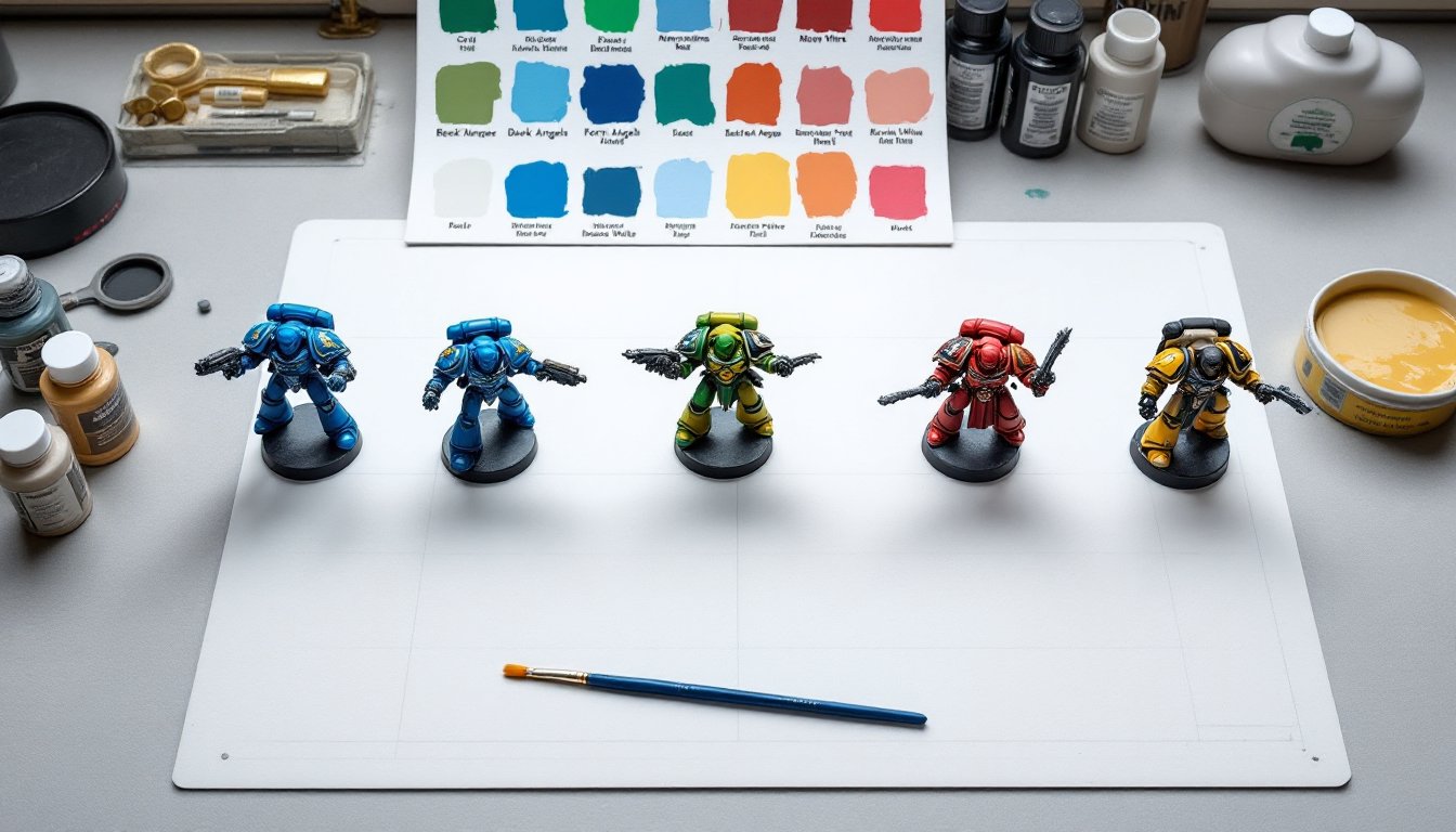
ToggleThe grim darkness of the far future might be a grimdark universe, but its color palettes? Surprisingly brilliant for interior design. Warhammer 40,000’s Space Marine chapters have spent decades perfecting bold, high-contrast color combinations that translate remarkably well to real-world room painting. Whether you’re setting up a dedicated gaming space, a home office, or just want to inject some serious visual punch into a bedroom, these militaristic color schemes offer a ready-made blueprint. They’re not subtle, but they’re balanced, each palette tested across thousands of miniatures and battle scenes. This guide breaks down five classic chapter schemes and shows how to adapt them for walls, trim, and accent zones.
Key Takeaways
- Space Marine color schemes use a battle-tested 60-70% dominant color, 20-30% secondary accent, and 10-15% metallic details—the exact ratio interior designers recommend for balanced rooms.
- Warhammer 40K color palettes map directly to commercial paint lines, so you can adapt bold space marine color schemes using off-the-shelf materials without custom mixing.
- Dark rooms larger than 120 square feet work best with moody colors like Dark Angels green or Blood Angels red, while smaller spaces benefit from the lighter-reflecting Ultramarines blue-and-gold combo.
- Successful application requires proper surface prep: fill nail holes, sand to 220-grit, use stain-blocking primer, and apply multiple coats—yellow and red especially need three coats for full coverage.
- Test paint samples in your specific space for 3–5 days under natural and artificial light before committing, as colors shift dramatically based on room orientation and lighting conditions.
- Avoid pairing Dark Angels green with dark wood furniture (creating a murky blend), use matte or eggshell finishes instead of satin, and ensure adequate ventilation when applying metallic paints.
Why Warhammer-Inspired Colors Work Perfectly for Home Spaces
Space Marine color schemes aren’t random, they’re engineered for maximum visual impact at tabletop scale, which makes them surprisingly functional for room design. Each chapter uses a dominant color (typically 60-70% coverage), a secondary accent (20-30%), and metallic or contrasting details (10-15%). That’s the exact ratio interior designers recommend for balanced rooms.
These palettes also solve a common DIY problem: decision paralysis. Instead of scrolling through 200 paint chips, you’re working from a proven triad. The schemes are inherently high-contrast, which helps define architectural features like door frames, chair rails, or built-in shelving without additional trim work.
One practical advantage: Warhammer color names often map directly to commercial paint lines. Citadel’s Macragge Blue, for instance, sits close to Benjamin Moore’s Starry Night Blue (2067-20), while Mephiston Red approximates Behr’s Red Pepper (PPU2-02). You’re not hunting for custom mixes, you’re adapting a battle-tested scheme with off-the-shelf materials.
Classic Blue and Gold: The Ultramarines Palette for Study Rooms
The Ultramarines’ cobalt blue and gold combination is the most beginner-friendly Space Marine scheme for interiors. The blue is bold but not aggressive, and gold accents add warmth without the sweetness of brass or copper tones.
Wall application: Use a deep cobalt or royal blue on three walls, something in the range of Sherwin-Williams Naval (SW 6244) or Behr Tanzanite (M520-7). Keep the fourth wall (ideally behind a desk or gaming table) in a warm off-white like Swiss Coffee or Alabaster to prevent the space from feeling like a cave. Ceiling should stay white: blue ceilings visually drop the height and make lighting tricky.
Trim and accents: Paint door frames, baseboards, and any built-in shelving in a metallic gold. Modern Masters Pale Gold or Rust-Oleum Metallic Gold spray paint (for small trim) both work. If brushing, use a small 2-inch angled sash brush, foam brushes leave streaks on metallics. Gold works best on smooth, primed surfaces: if your trim has heavy texture, consider a matte mustard yellow instead (like Behr Golden Age, P300-6) to avoid a gaudy look.
Lighting considerations: Blue walls absorb a lot of light. Budget for 4,000–5,000 lumens total in a 12×12-foot room. Use warm white bulbs (2700–3000K) to keep the gold tones rich: cool LEDs will make the blue feel sterile. This palette pairs well with natural wood desks and black metal shelving, avoid too much chrome, which clashes with gold.
Dark Green and Bone: Bringing the Dark Angels Aesthetic Home
The Dark Angels scheme, deep forest green with bone or cream accents, creates a moody, layered look that works exceptionally well in media rooms, libraries, or basement spaces. It’s one of the more forgiving palettes for uneven wall textures because the dark green hides imperfections.
Base color: Go with a near-black green like Sherwin-Williams Rookwood Dark Green (SW 2816) or Benjamin Moore Forest Green (2047-10). These read as charcoal in low light but show green undertones near windows. Apply two coats over a gray-tinted primer, white primer requires three coats to avoid patchiness. A 9-inch roller with ½-inch nap handles most drywall: use a ¾-inch nap if your walls have orange-peel texture.
Bone accents: Paint one accent wall, ceiling beams, or wainscoting in a warm bone tone, Behr Cottage White (PPU18-06) or Valspar Pale Ivory (7006-4). The key is avoiding pure white, which creates too harsh a contrast against the green. Bone also weathers better: scuffs and touch-ups blend invisibly.
Practical warning: Dark green shows every speck of dust and requires frequent touch-ups around light switches. Use satin or eggshell finish instead of flat: it’s wipeable without being reflective. Keep a small touch-up jar and a 2-inch brush, you’ll need it. Many homeowners who tackle bold paint projects recommend priming switch plates separately before reinstalling to avoid bare spots.
Red and Black Drama: Blood Angels-Inspired Accent Walls
Blood Angels red is aggressive, think Behr Matador (S-G-180) or Sherwin-Williams Real Red (SW 6868), and it’s best used sparingly unless you’re painting a dedicated hobby room. This scheme thrives on the 80/20 rule: neutral base with red and black accents.
Recommended approach: Paint three walls in a medium gray like Behr Silver Drop (N520-3) or SW Repose Gray (7015). Use the red on a single accent wall, ideally one with minimal windows, as direct sunlight fades red pigments faster than other colors. Black works for trim, but only on the accent wall: full-room black trim makes spaces feel cramped.
Application tips: Red requires excellent prep. Fill every nail hole with lightweight spackling, sand to 220-grit, and use a stain-blocking primer (Zinsser B-I-N or Kilz Original). Red pigments are thin and translucent, any imperfection telegraphs through. Plan on three coats for full coverage, letting each dry 4 hours minimum. A high-density foam roller (not cheap foam, it leaves bubbles) gives the smoothest finish.
Balancing the drama: Add black metal shelving, matte black outlet covers, and warm wood furniture to ground the red. If the red feels overwhelming after 48 hours, it probably is, reds look more intense once fully cured. Consider dropping to a burgundy like Behr Bordeaux (PPU1-01) for a less aggressive vibe. Current interior design trends favor these deeper wine tones over bright reds for gaming and media spaces.
Yellow and Black Contrast: Imperial Fists Bold Statement Rooms
Imperial Fists yellow is the most technically challenging Space Marine scheme to execute well. Yellow paint is notoriously finicky, thin pigments, poor coverage, and a tendency to look dingy if not applied correctly. But when done right, yellow and black creates a high-energy space perfect for workshops, hobby rooms, or creative studios.
Yellow selection matters: Avoid bargain-bin yellows. Use a premium paint with high pigment load, Behr Marquee in Yellow Groove (M300-5) or Sherwin-Williams Confident Yellow (SW 6911). Both are formulated for two-coat coverage. Start with a light gray primer (not white, it makes yellows look greenish). Apply the first yellow coat vertically with a ½-inch nap roller, the second horizontally. This crosshatch technique minimizes streaking.
Black accents: Use matte black on one accent wall or for wainscoting up to 32–36 inches (standard chair rail height). Black baseboards and door frames create sharp definition. If painting both colors in the same room, always paint the yellow first, black bleeds through yellow, but yellow won’t cover black mistakes. Use 2-inch painter’s tape (FrogTape yellow label for delicate surfaces) and remove it while the top coat is still tacky to prevent peeling.
Lighting is non-negotiable: Yellow walls amplify light, which sounds great until you have glare on every screen. Install dimmable LED panels or track lighting you can angle away from reflective surfaces. Use matte or eggshell finish, never satin, yellow shows roller marks and sheen variations more than any other color. Examples of bold home color applications can be found in modern luxury home features, where designers balance saturated tones with strategic lighting.
How to Choose the Right Space Marine Color Scheme for Your Room
Matching a chapter scheme to your space depends on room function, natural light, and existing furniture. Here’s the breakdown:
Room size and light: Dark schemes (Dark Angels green, Blood Angels red) work best in rooms larger than 120 square feet with decent natural light or strong artificial lighting. Smaller rooms benefit from the Ultramarines blue-and-gold combo, which reflects more light. Yellow (Imperial Fists) is size-neutral but demands excellent lighting control.
Function: Study rooms and offices pair well with Ultramarines blue, it’s bold but not distracting. Media rooms and basements suit Dark Angels green or Blood Angels red for a cocoon effect. Workshops and hobby spaces thrive with Imperial Fists yellow and black for high visibility and energy.
Existing elements: If you have dark wood furniture, avoid the Dark Angels scheme, it’ll all blend into a murky soup. Light oak or pine works with any palette. Black metal shelving and desks are universal anchors. If you’re keeping carpet, make sure it’s neutral (gray, tan, charcoal), patterned or colored carpet fights with these bold walls.
Test before committing: Buy sample pots (8 oz) and paint 2×2-foot squares on different walls. Live with them for 3–5 days, checking how they look in morning light, afternoon sun, and under artificial light. Colors shift dramatically based on orientation, a north-facing room will make reds look muddy, while southern exposure can bleach yellows.
Permit and safety note: These are cosmetic projects requiring no permits. Wear safety glasses when cutting trim, use dust masks when sanding, and ensure adequate ventilation when using oil-based primers or metallic paints. If you’re painting over pre-1978 construction, test for lead paint before sanding, disturbing lead paint requires professional abatement in most jurisdictions.
Conclusion
Space Marine color schemes strip room design down to proven, high-impact palettes. Whether it’s the dependable Ultramarines blue-and-gold, the moody Dark Angels green, or the aggressive Blood Angels red, each scheme offers a clear roadmap from primer to final coat. The trick isn’t copying these palettes exactly, it’s understanding their ratios, testing them in your specific light conditions, and prepping surfaces properly. Skip the prep, and even the Emperor’s finest color scheme will look like a rushed tabletop paint job.